Every documentation site requires a docs.json file that contains the core configuration settings. This file controls everything from styling and navigation to integrations and analytics.
If you’re currently using the legacy mint.json configuration file, please update the CLI: And run the new upgrade command in your docs repository: This will generate a docs.json based off of your mint.json. Then, please delete the mint.json file from your repository. Properties Customization theme
"mint" | "maple" | "palm" | "willow" | "linden"
required
The layout theme of the project. Check out the Themes page for more information. The name of the project, organization, or product Minimum length: 1
Optional description used for SEO and LLM indexing
Styling The colors to use in your documentation. At the very least, you must define the primary color. For example: { "colors" : { "primary" : "#ff0000" } }
primary
string matching ^#([a-fA-F0-9]{6}|[a-fA-F0-9]{3})$
required
The primary color of the theme Must match pattern: ^#([a-fA-F0-9]|[a-fA-F0-9])$
light
string matching ^#([a-fA-F0-9]{6}|[a-fA-F0-9]{3})$
The light color of the theme. Used for dark mode Must match pattern: ^#([a-fA-F0-9]|[a-fA-F0-9])$
dark
string matching ^#([a-fA-F0-9]{6}|[a-fA-F0-9]{3})$
The dark color of the theme. Used for light mode Must match pattern: ^#([a-fA-F0-9]|[a-fA-F0-9])$
The logo (for both light and dark mode) Path pointing to the light logo file to use in dark mode, including the file extension. Example: /logo.png
Path pointing to the dark logo file to use in light mode, including the file extension. Example: /logo-dark.png
The URL to redirect to when clicking the logo. If not provided, the logo will link to the homepage. Example: https://example.com
The path to your favicon file in the docs folder, including the file extension. The file will automatically be resized to appropriate favicon sizes.
Can be a single file or a pair for light and dark mode. Example: /favicon.png Path pointing to the light favicon file to use in dark mode, including the file extension. Example: /favicon.png
Path pointing to the dark favicon file to use in light mode, including the file extension. Example: /favicon-dark.png
Styling configurations eyebrows
"section" | "breadcrumbs"
The eyebrows style of the content. Defaults to section.
The codeblock theme. Defaults to system.
Icon library settings library
"fontawesome" | "lucide"
required
The icon library to be used. Defaults to fontawesome.
The font family, such as “Open Sans”, “Playfair Display”
The font weight, such as 400, 700. Precise font weights such as 550 are supported for variable fonts.
The font format, can be one of woff, woff2
The font family, such as “Open Sans”, “Playfair Display”
The font weight, such as 400, 700. Precise font weights such as 550 are supported for variable fonts.
The font format, can be one of woff, woff2
The font family, such as “Open Sans”, “Playfair Display”
The font weight, such as 400, 700. Precise font weights such as 550 are supported for variable fonts.
The font format, can be one of woff, woff2
Light / dark mode toggle settings default
"system" | "light" | "dark"
The default light/dark mode. Defaults to system
Whether to hide the light / dark mode toggle. Defaults to true.
Background color and decoration settings decoration
"gradient" | "grid" | "windows"
The background decoration of the theme
The colors of the background light
string matching ^#([a-fA-F0-9]{6}|[a-fA-F0-9]{3})$
The color in hex format to use in light mode Must match pattern: ^#([a-fA-F0-9]|[a-fA-F0-9])$
dark
string matching ^#([a-fA-F0-9]{6}|[a-fA-F0-9]{3})$
The color in hex format to use in dark mode Must match pattern: ^#([a-fA-F0-9]|[a-fA-F0-9])$
Structure Navbar content and settings The links in the navbar A valid path or external link
type
"button" | "github"
required
The label for the primary button. This only applies when type is set to button.
A valid path or external link. If type is set to github, this will be the URL to the repository.
The navigation structure of the content Add external links that will appear on all sections and pages irregardless of navigation nesting language
"en" | "cn" | "zh" | "zh-Hans" | "zh-Hant" | "es" | "fr" | "ja" | "jp" | "pt" | "pt-BR" | "de" | "ko" | "it" | "ru" | "id" | "ar" | "tr"
required
The name of the language in the ISO 639-1 format
Whether this language is the default language
Whether the current option is default hidden
A valid path or external link
The name of the version Minimum length: 1
Whether this version is the default version
Whether the current option is default hidden
The name of the tab Minimum length: 1
The icon to be displayed in the section
Whether the current option is default hidden
The name of the anchor Minimum length: 1
The icon to be displayed in the section
light
string matching ^#([a-fA-F0-9]{6}|[a-fA-F0-9]{3})$
The color in hex format to use in light mode Must match pattern: ^#([a-fA-F0-9]|[a-fA-F0-9])$
dark
string matching ^#([a-fA-F0-9]{6}|[a-fA-F0-9]{3})$
The color in hex format to use in dark mode Must match pattern: ^#([a-fA-F0-9]|[a-fA-F0-9])$
Whether the current option is default hidden
A valid path or external link
The name of the dropdown Minimum length: 1
The icon to be displayed in the section
Whether the current option is default hidden
pages
array of string or object
Footer configurations An object in which each key is the name of a social media platform, and each value is the url to your profile. For example: { "x" : "https://x.com/mintlify" }
Valid property names: x, website, facebook, youtube, discord, slack, github, linkedin, instagram, hacker-news, medium, telegram, twitter, x-twitter, earth-americas, bluesky, threads, reddit, podcast The links to be displayed in the footer The header title of the column Minimum length: 1
The links to be displayed in the column The label of the link Minimum length: 1
Banner configurations The content of the banner. This can be a string of text or a markdown string. For example: { "content" : "🚀 Banner is live! [Learn more](mintlify.com)" }
Whether the banner is dismissible. Defaults to false.
options
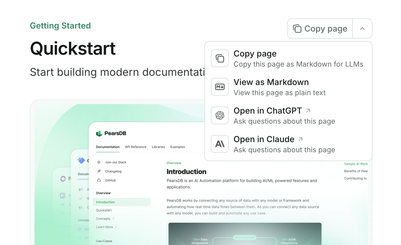
array of "copy" | "view" | "chatgpt" | "claude"
required
The options to be displayed in the contextual menu. The first option is the default option.
copy: Copy the current page as markdown to the clipboardview: View the current page as markdown in a new tabchatgpt: Feed the current page to ChatGPTclaude: Feed the current page to Claude The contextual menu is only available on preview & production deployments.
API Configurations API reference configuration and playground settings openapi
string or array or object
A string or an array of strings of absolute or relative urls pointing to the OpenAPI file(s) no starting slash in the directory
asyncapi
string or array or object
A string or an array of strings of absolute or relative urls pointing to the AsyncAPI file(s) Configurations for the API playground display
"interactive" | "simple" | "none"
The display mode of the API playground. Defaults to interactive.
Whether to pass API requests through a proxy server. Defaults to true.
Configurations for the autogenerated API examples Example languages for the autogenerated API snippets
Configurations for API pages generated from MDX files Authentication configuration for the API method
"bearer" | "basic" | "key" | "cobo"
Authentication method for the API
Authentication name for the API
SEO & Search SEO indexing configurations Meta tags added to every page. Must be a valid key-value pair. Possible options here Specify which pages to be indexed by search engines. Setting navigable indexes pages that are set in navigation, all indexes all pages. Defaults to navigable.
Search display settings The prompt to be displayed in the search bar placeholder
Integrations Configurations for official integrations measurementId
string matching ^G
required
Must match pattern: ^G
tagId
string matching ^G
required
Must match pattern: ^G
apiKey
string matching ^phc\_
required
Must match pattern: ^phc_
Errors Whether to redirect to the home page, if the page is not found
Best Practices When configuring your docs.json file, consider these best practices:
Keep the configuration organized by grouping related settings together
Use meaningful names for groups and pages in your navigation structure
Provide complete paths for all assets (logos, favicons, etc.)
Test your configuration in both light and dark modes
Verify all external links and integrations are correctly configured
Use appropriate color contrasts for accessibility
Configure SEO settings for better search engine visibility
Validation The docs.json file is validated against a JSON schema to ensure proper configuration. You can reference the schema by including:
{ "$schema" : "https://mintlify.com/docs.json" }
mint.json (Legacy)
Documentation for the legacy `mint.json` config file
Every Mintlify site needs a mint.json file with the core configuration
settings. Learn more about the properties or from an
example Properties Styling Name of your company or project. Used for the global title.
Path to logo image or object with path to “light” and “dark” mode logo images,
and where the logo links to. SVG format is recommended. It does not pixelate
and the file size is generally smaller. Path to the logo in light mode. For example: /path/to/logo.svg
Path to the logo in dark mode. For example: /path/to/logo.svg
Where clicking on the logo links you to
Path to the favicon image. For example: /path/to/favicon.svg
Hex color codes for your global theme The primary color. Used most often for highlighted content, section
headers, accents, in light mode
The primary color for dark mode. Used most often for highlighted content,
section headers, accents, in dark mode
The primary color for important buttons
The color of the background in both light and dark mode The hex color code of the background in light mode
The hex color code of the background in dark mode
theme
"venus" | "quill" | "prism"
A preset theme configuration that changes the look and feel of the project. A
theme is a set of default styling configurations. Examples:
Venus ,
Quill ,
Prism layout
"topnav" | "sidenav" | "solidSidenav"
default: "topnav"
The global layout style of the documentation.
Set a decorative background. style
"gradient" | "grid" | "windows"
The style of the decorative background.
Set a custom background image to be displayed behind every page.
Custom fonts. Apply globally or set different fonts for headings and the body
text. Example: "font" : { "headings" : { "family" : "Roboto" }, "body" : { "family" : "Oswald" } }
The font family name. Custom fonts and all Google
Fonts are supported. e.g. “Open Sans”,
“Playfair Display” The font weight. Precise values such as 560 are also supported for
variable fonts. Check under the Styles section for your Google Font for
the available weights.
The URL to the font file. Can be used to specify a font that is not from
Google Fonts.
The font format. Required if using a custom font source (url).
Customize the dark mode toggle. Set if you always want to show light or dark mode for new users. When not
set, we default to the same mode as the user’s operating system.
Set to true to hide the dark/light mode toggle. You can combine isHidden with default to force your docs to only use light or dark mode. For example: Only Dark Mode
Only Light Mode
"modeToggle" : { "default" : "dark" , "isHidden" : true }
Customize the styling of components within the sidebar. items
"container" | "card" | "border" | "undecorated"
default: "container"
The styling of the navigation item.
Styling configurations for the topbar. style
"default" | "gradient"
default: "default"
The styling of the navigation item.
The location options for the search bar. The location of the search bar.
The style of the rounded edges.
The style of the code block. mode
"dark" | "auto"
default: "dark"
auto will automatically switch between light and dark mode based on the
user’s system preferences.
Structure An array of groups with all the pages within that group The relative paths to the markdown files that will serve as pages. Note: groups are recursive, so to add a sub-folder add another group object in the page array.
The type of icon (only for Font Awesome icons). Must be one of: brands, duotone, light, sharp-solid, solid, thin Array of names and urls of links you want to include in the topbar The url once you click on the button. Example: https://mintlify.com/contact
Show Topbar Call to Action
type
link or github
default: "link"
Link shows a button. GitHub shows the repo information at the url provided
including the number of GitHub stars.
If type is a link: What the button links to. If type is a github: Link to
the repository to load GitHub information from.
Text inside the button. Only required if type is a link.
style
"pill" | "roundedRectangle"
The style of the button.
Whether to display the arrow
Array of version names. Only use this if you want to show different versions
of docs with a dropdown in the navigation bar. Versions can be leveraged for localization. You can store translated content
under a version, and once you specify the locale any fixed text in Mintlify,
such as ‘Was this page helpful?’, will automatically be translated based on the
locale. We currently support localization in English, Chinese, Spanish, French,
Japanese, and Portuguese. Localization auto-translates the UI and fixed assets in the docs, such as “Was
this page helpful?”. You must translate the content of the pages yourself.
For more information, please refer to our
versioning & localization documentation . Example: "versions" : [ "v1.0" , "v1.1" ]
The locale of the version. Supported locales are en, cn, es, fr, jp, pt, pt-BR, de.
Whether the version is the default version. Handy for when you have a “latest” and “stable” version and you want to default to the stable version.
An array of the anchors, includes the icon, color, and url. The name of the anchor label. Example: Community
The start of the URL that marks what pages go in the anchor. Generally, this is the name of the folder you put your pages in.
The hex color of the anchor icon background. Can also be a gradient if you pass an object with the properties from and to that are each a hex color.
Used if you want to hide an anchor until the correct docs version is selected.
Pass true if you want to hide the anchor until you directly link someone to docs inside it.
One of: “brands”, “duotone”, “light”, “sharp-solid”, “solid”, or “thin”
Override the default configurations for the top-most anchor. Note: if you have
tabs configured, this does not apply. name
string
default: "Documentation"
required
The name of the top-most anchor
icon
string
default: "book-open"
Font Awesome icon.
One of: “brands”, “duotone”, “light”, “sharp-solid”, “solid”, or “thin”
An array of navigational tabs. Example: "tabs" : [ { "name" : "Writing Content" , "url" : "content" }, { "name" : "API References" , "url" : "api-playground" } ]
The name of the tab label.
The start of the URL that marks what pages go in the tab. Generally, this
is the name of the folder you put your pages in.
Pass true if you want to hide the tab until you directly link someone to docs inside it.
An object to configure the footer with socials and links.
Example: "footer" : { "socials" : { "x" : "https://x.com/mintlify" , "website" : "https://mintlify.com" }, "links" : [ { "title" : "Column 1" , "links" : [ { "label" : "Column 1 Link 1" , "url" : "https://mintlify.com" }, { "label" : "Column 1 Link 2" , "url" : "https://mintlify.com" } ] }, { "title" : "Column 2" , "links" : [ { "label" : "Column 2 Link 1" , "url" : "https://mintlify.com" }, { "label" : "Column 2 Link 2" , "url" : "https://mintlify.com" } ] } ] }
One of the following values website, facebook, x, youtube, discord, slack, github, linkedin, instagram, hacker-news, medium, telegram, twitter Example: x
The URL to the social platform. Example: https://x.com/mintlify
links
{ label: string, url: string }[]
The link items in the column. External urls that starts with https:// or http:// will be opened in new tab.
Configurations to enable feedback buttons Enables a rating system for users to indicate whether the page has been helpful
Enables a button to allow users to suggest edits via pull requests for public repositories. If your docs repo is private, suggestEdit will not work.
Enables a button to allow users to raise an issue about the documentation
Configurations to change the search prompt prompt
string
default: "undefined"
Set the prompt for the search bar. Default is Search...
API Configurations Configuration for API settings. Learn more about API pages at API Components . The base url for all API endpoints. If baseUrl is an array, it will enable for multiple base url
options that the user can toggle.
method
"bearer" | "basic" | "key"
The authentication strategy used for all API endpoints.
The name of the authentication parameter used in the API playground. If method is basic, the format should be [usernameName]:[passwordName]
The default value that’s designed to be a prefix for the authentication input field. E.g. If an inputPrefix of AuthKey would inherit the default input result of the authentication field as AuthKey.
Configurations for the API playground mode
"show" | "simple" | "hide"
default: "show"
Whether the playground is showing, hidden, or only displaying the endpoint with no added user interactivity simple Learn more at the playground guides By default, API playground requests are proxied by Mintlify. This setting can be used to disable this behavior. Required for select request types, such as file uploads.
Configurations for API requests Configurations for the auto-generated API request examples An array of strings that determine the order of the languages of the auto-generated request examples. You can either define custom languages utilizing x-codeSamples or use our default languages which include bash, python, javascript, php, go, java Configurations for the param fields in the API Playground expanded
"all" | "topLevel" | "topLevelOneOfs" | "none"
default: "none"
The default expanded state of expandable options in the API playground. "all" - every expandable component is expanded"topLevel" - every top-level expandable component is expanded"topLevelOneOfs" - every top-level oneOf type is expanded"none" - every expandable component is closed (default behavior)
A string or an array of strings of URL(s) or relative path(s) pointing to your
OpenAPI file. Examples: "openapi" : "https://example.com/openapi.json"
Integrations Configurations to add third-party integrations (excluding analytics integrations) Enables Intercom widget on docs site. The value should be your Intercom App ID.
Enables Frontchat widget on docs site. The value should be your Frontchat App ID.
Configurations to add third-party analytics integrations. See full list of
supported analytics here . Redirects An array of paths you want to configure to permanently redirect to another path Example: "redirects" : [ { "source" : "/source/path" , "destination" : "/destination/path" } ]
The path that you want to redirect from. Example: /source
The path that you want to redirect to. Example: /destination
Search Engine Optimization Settings for Search Engine Optimization. Example: "seo" : { "indexHiddenPages" : true }
Enables indexing pages not included in navigation.
Example mint.json Click on the following dropdown to view a sample configuration file
View Example Configuration
{ "name" : "Mintlify" , "logo" : { "light" : "/logo/light.svg" , "dark" : "/logo/dark.svg" }, "favicon" : "/favicon.svg" , "colors" : { "primary" : "#16A34A" , "light" : "#4ADE80" , "dark" : "#166534" }, "topbarLinks" : [ { "name" : "Contact Us" , "url" : "mailto:support@mintlify.com" } ], "topbarCtaButton" : { "name" : "Get Started" , "url" : "https://mintlify.com/start" }, "anchors" : [ { "name" : "API Components" , "icon" : "rectangle-terminal" , "color" : "#f59f0b" , "url" : "api-components" }, { "name" : "Community" , "icon" : "comments" , "color" : "#2564eb" , "url" : "https://mintlify.com/community" } ], "navigation" : [ { "group" : "Getting Started" , "pages" : [ "introduction" , "quickstart" ] }, { "group" : "API Components" , "pages" : [ "api-playground/overview" , "api-playground/configuration" ] }, { "group" : "Settings" , "pages" : [ "settings/global" , "settings/page" ] }, { "group" : "Analytics" , "pages" : [ "analytics/posthog" ] } ], "footerSocials" : { "github" : "https://github.com/mintlify" , "slack" : "https://mintlify.com/community" , "x" : "https://x.com/mintlify" }, "integrations" : { "intercom" : "APP_ID" , "frontchat" : "CHAT_ID" } }